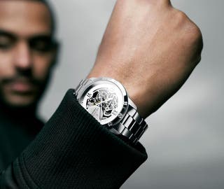
To Learn is to Live
And to adapt is to thrive
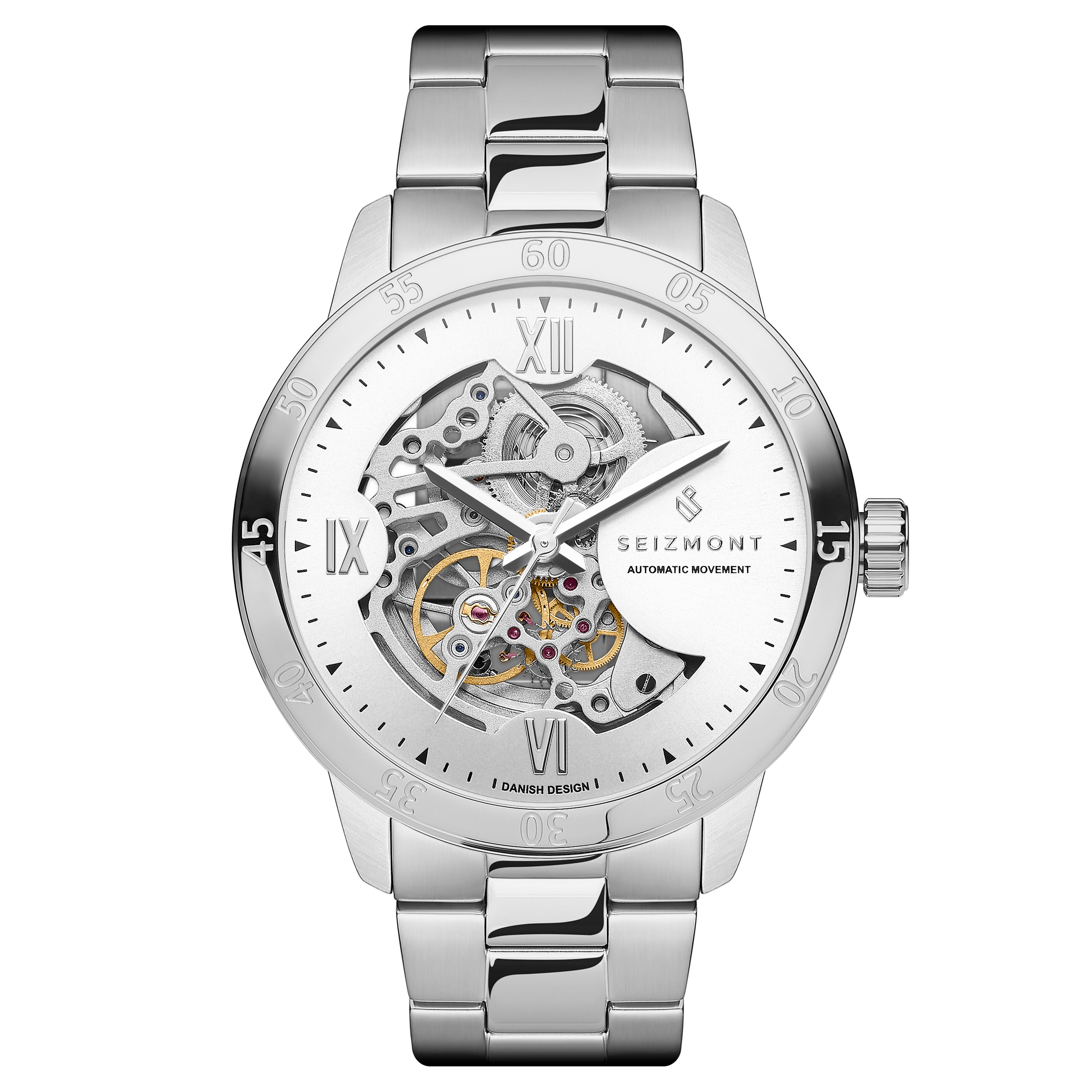
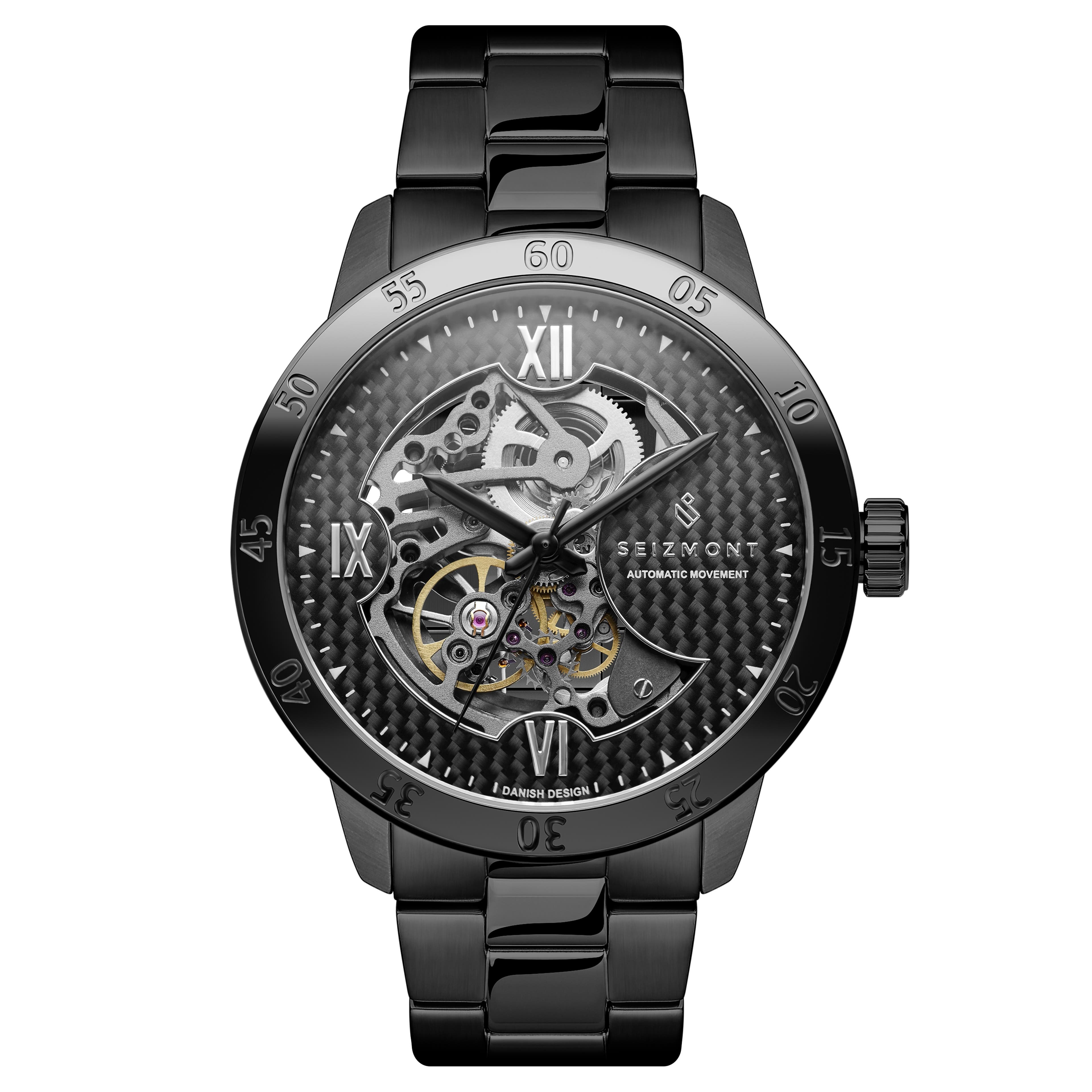
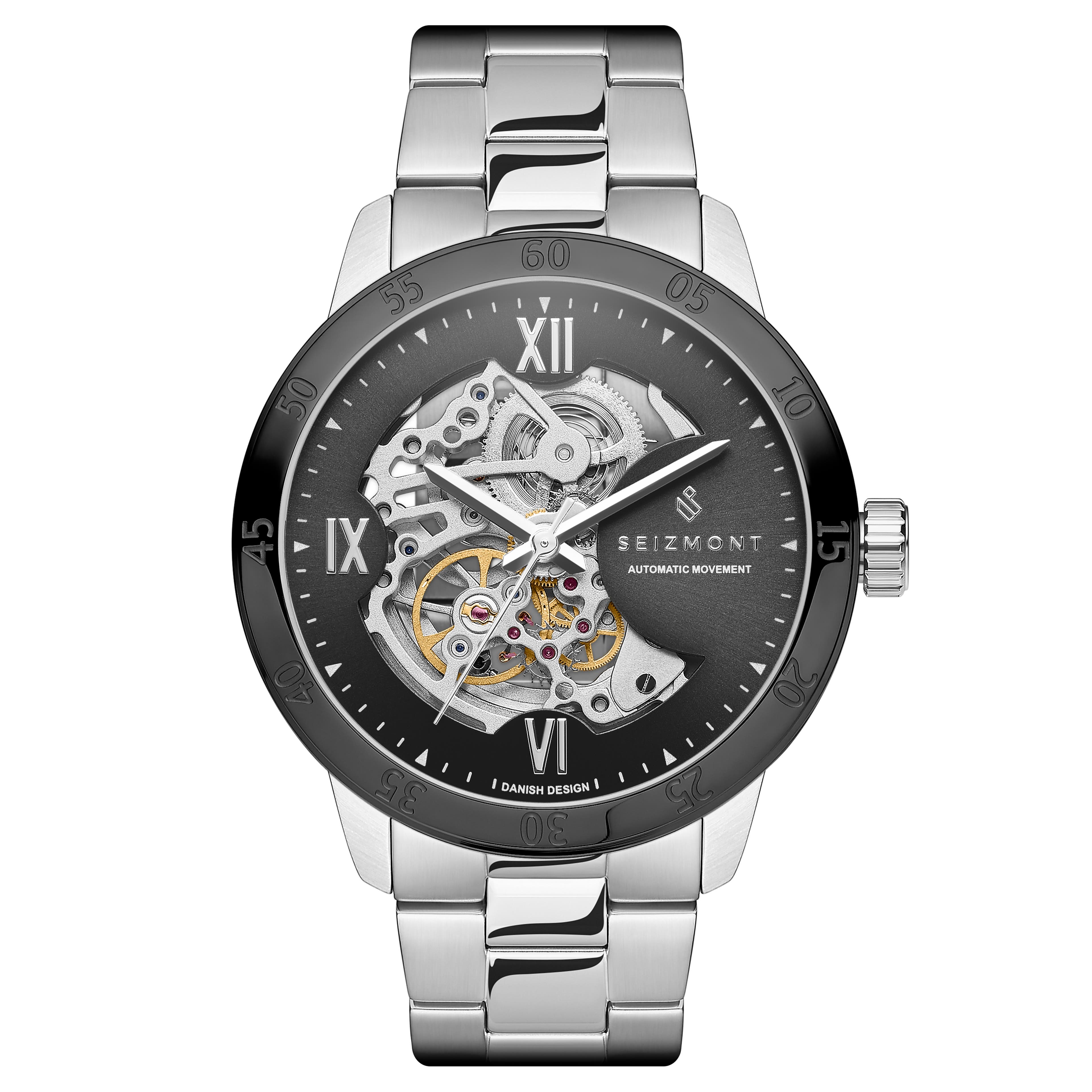
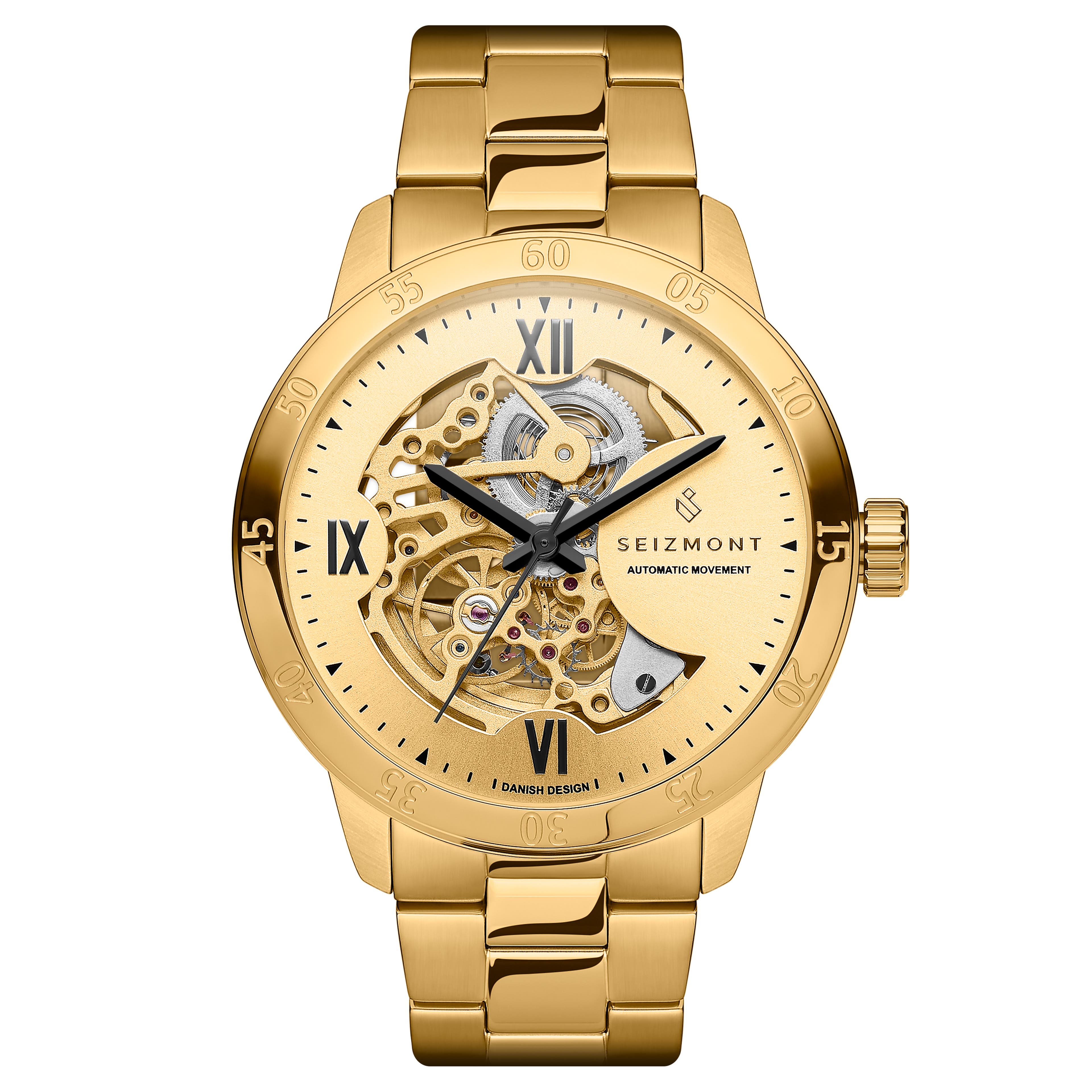
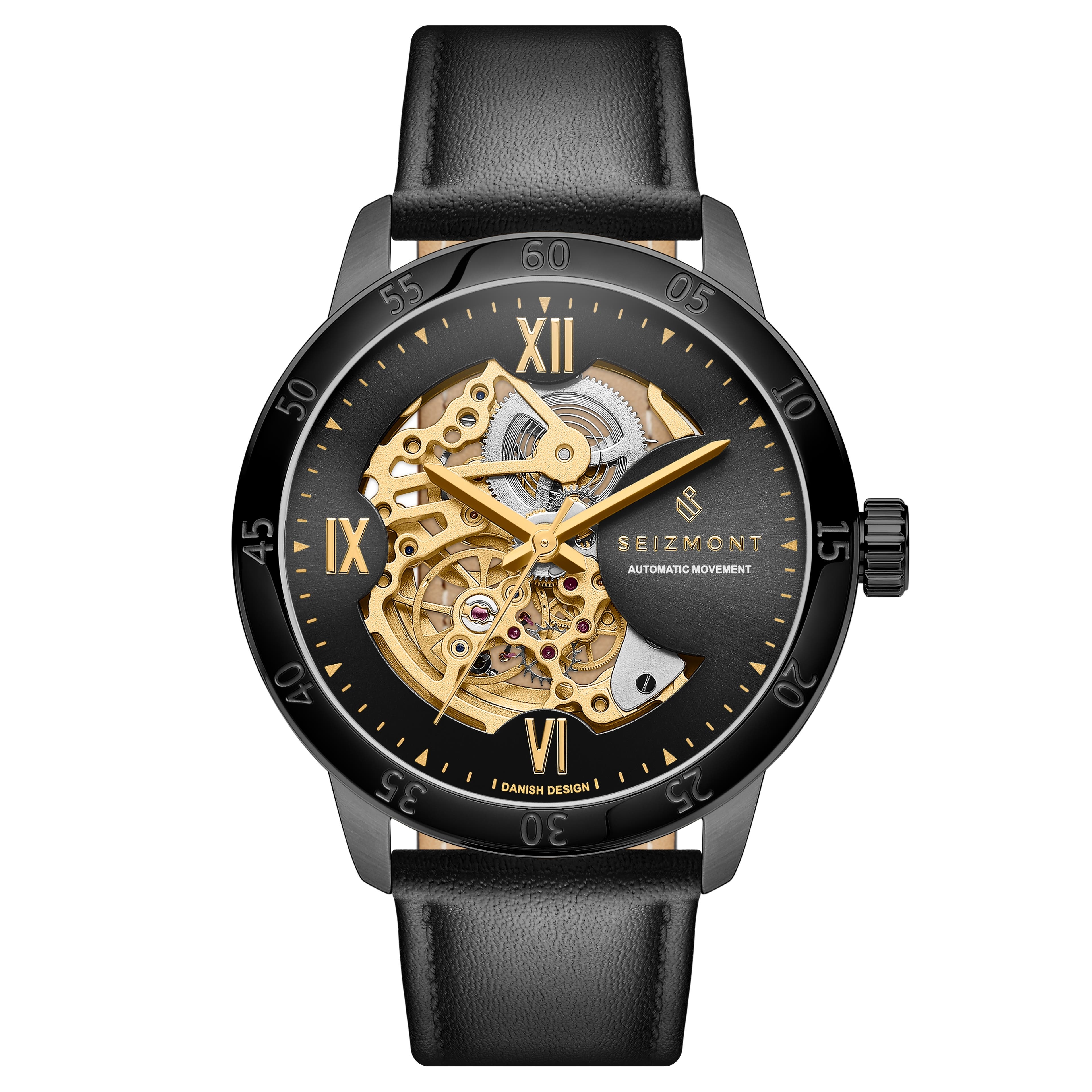
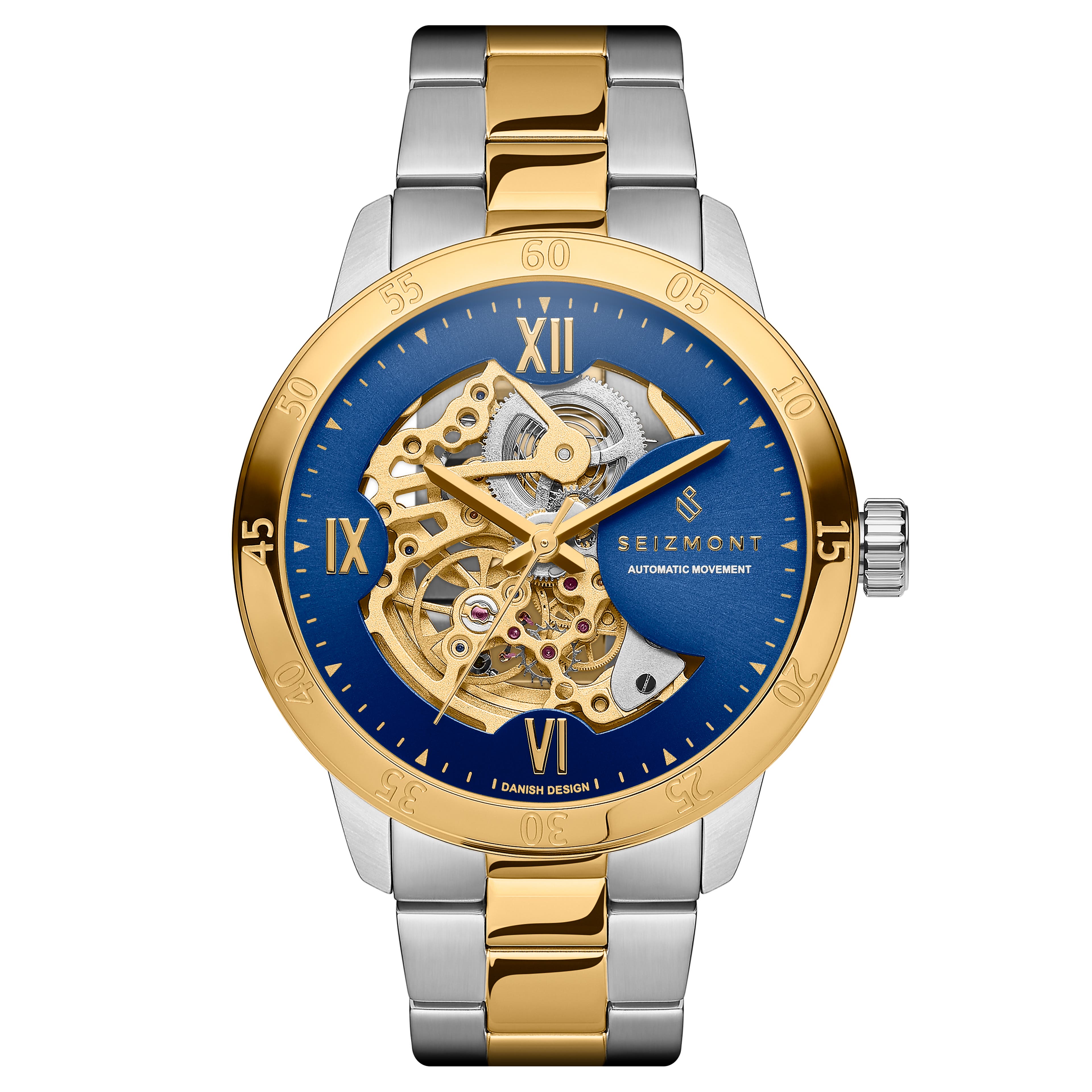
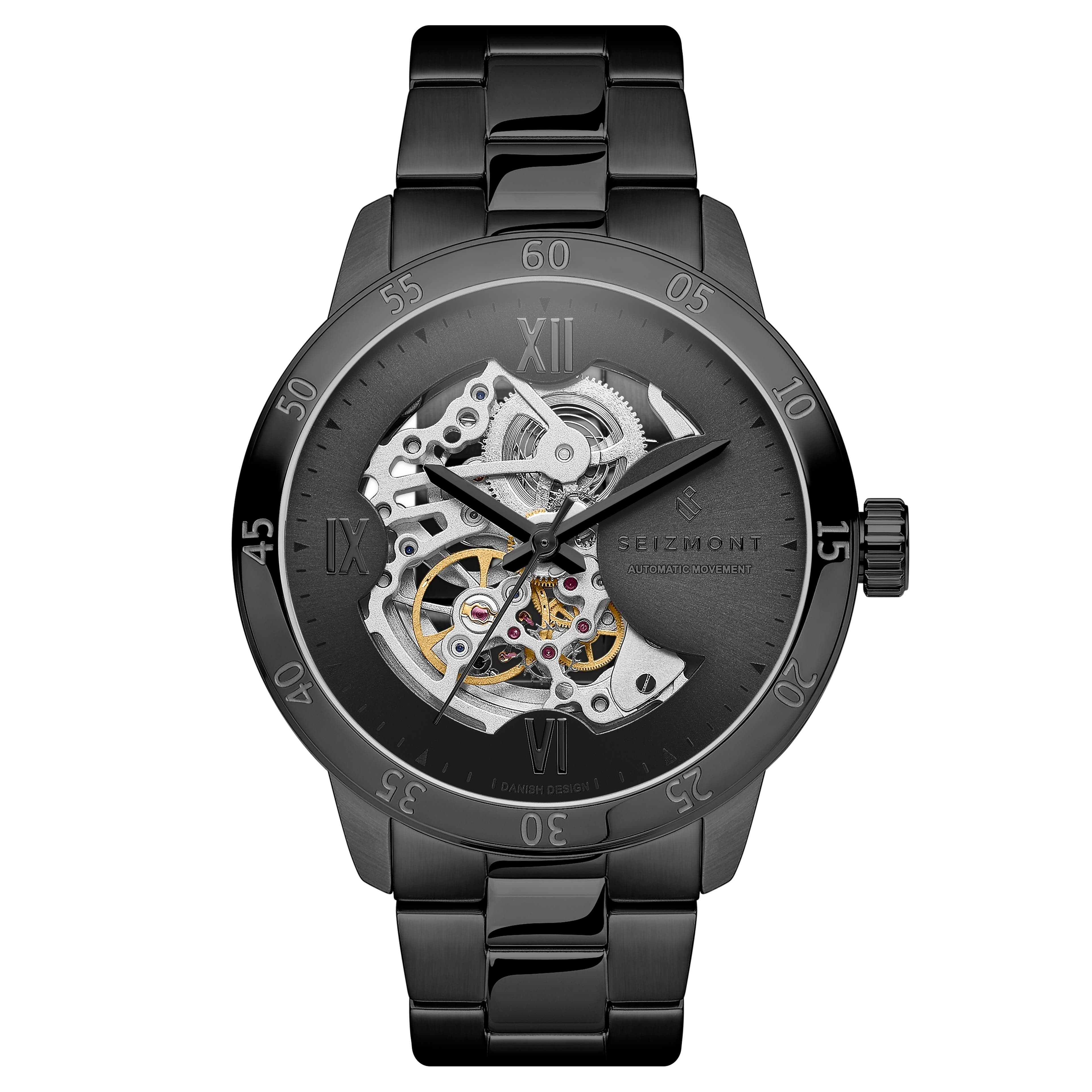
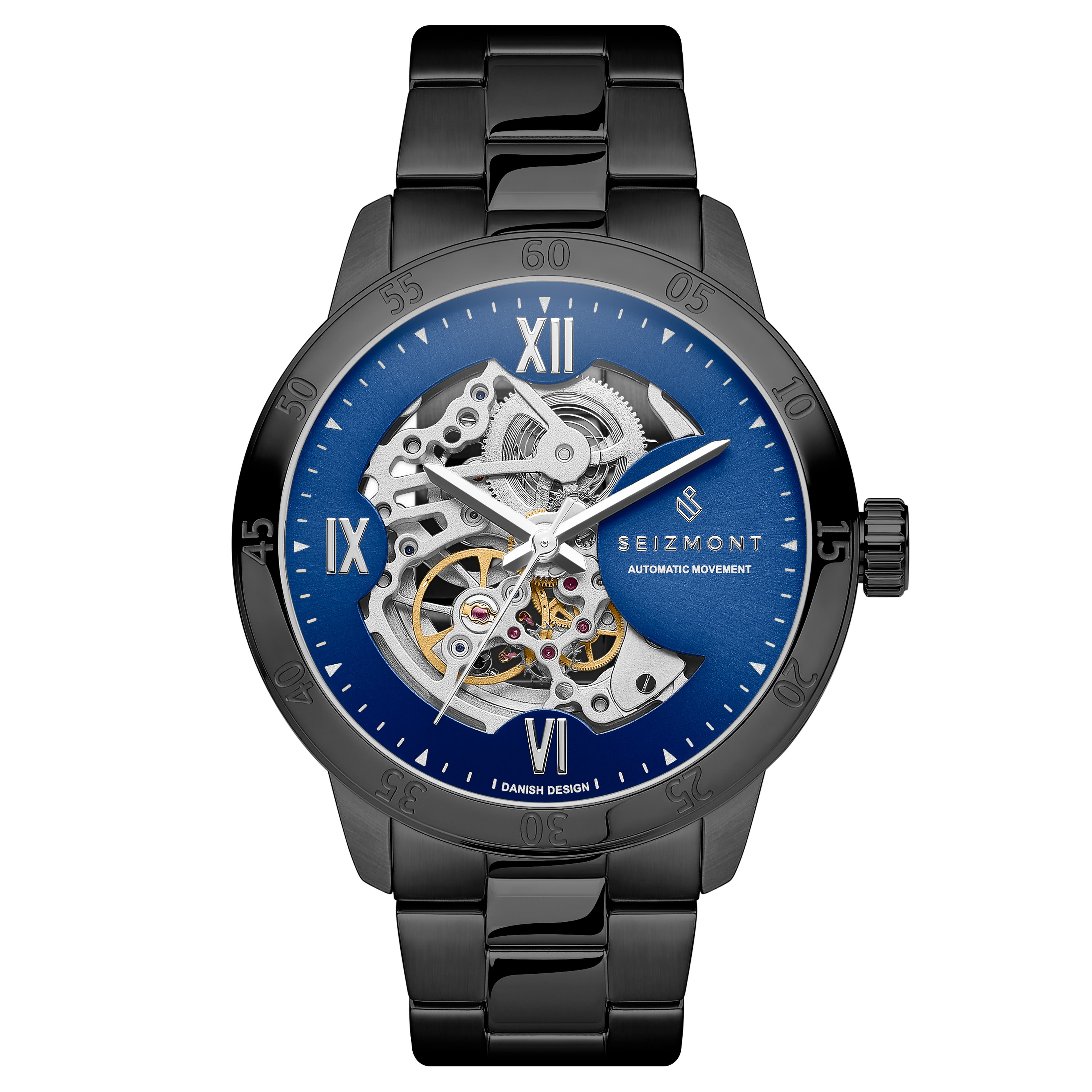
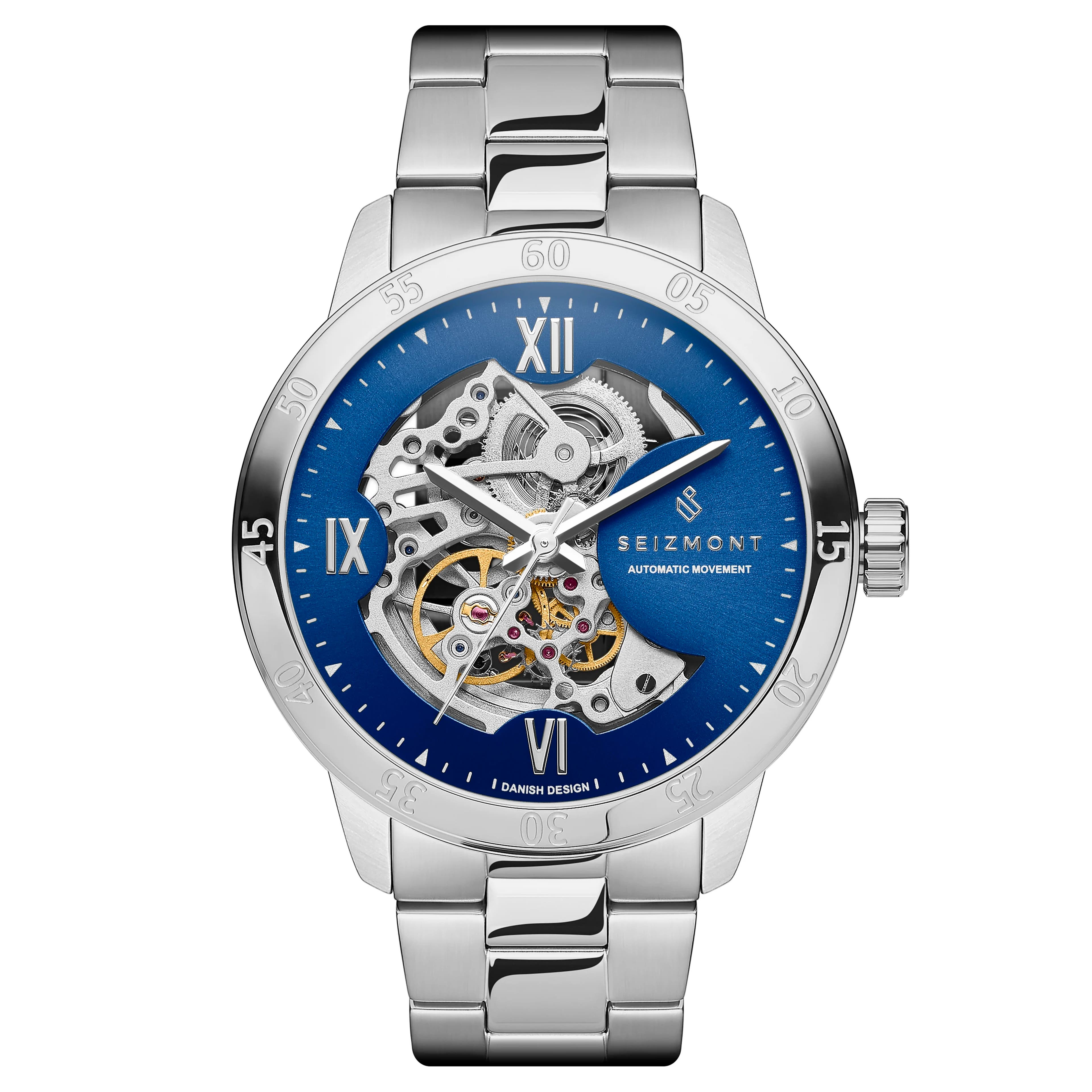
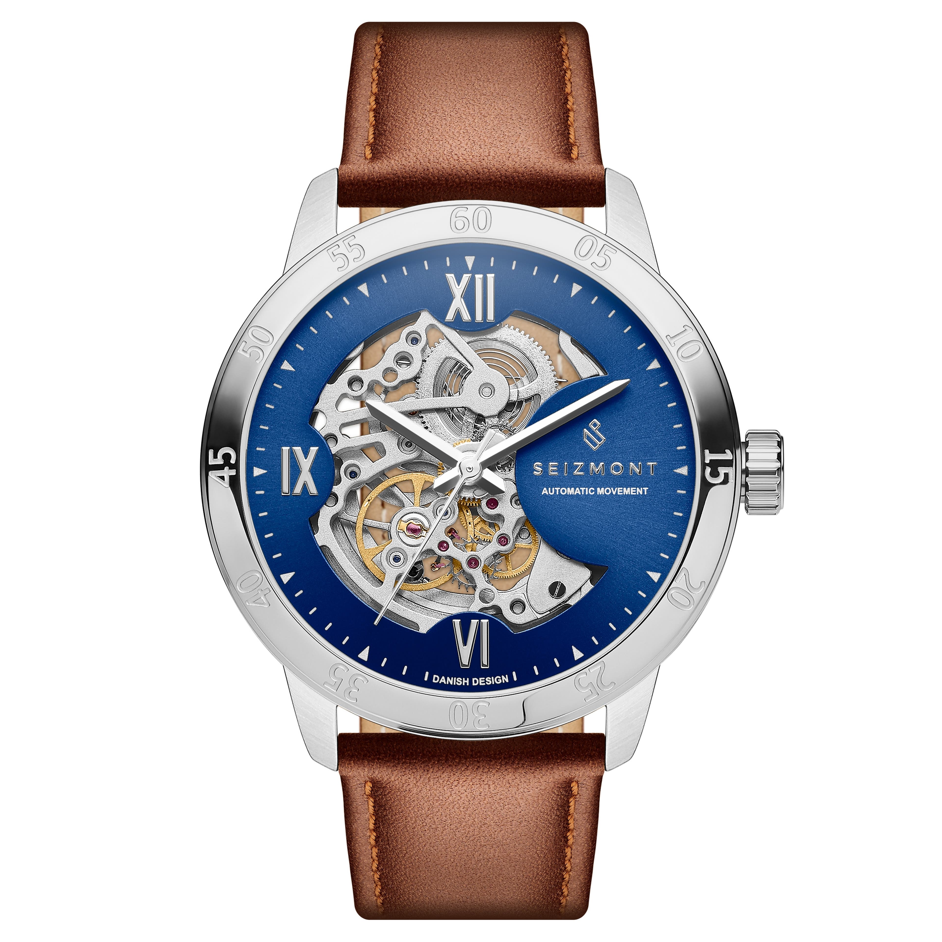
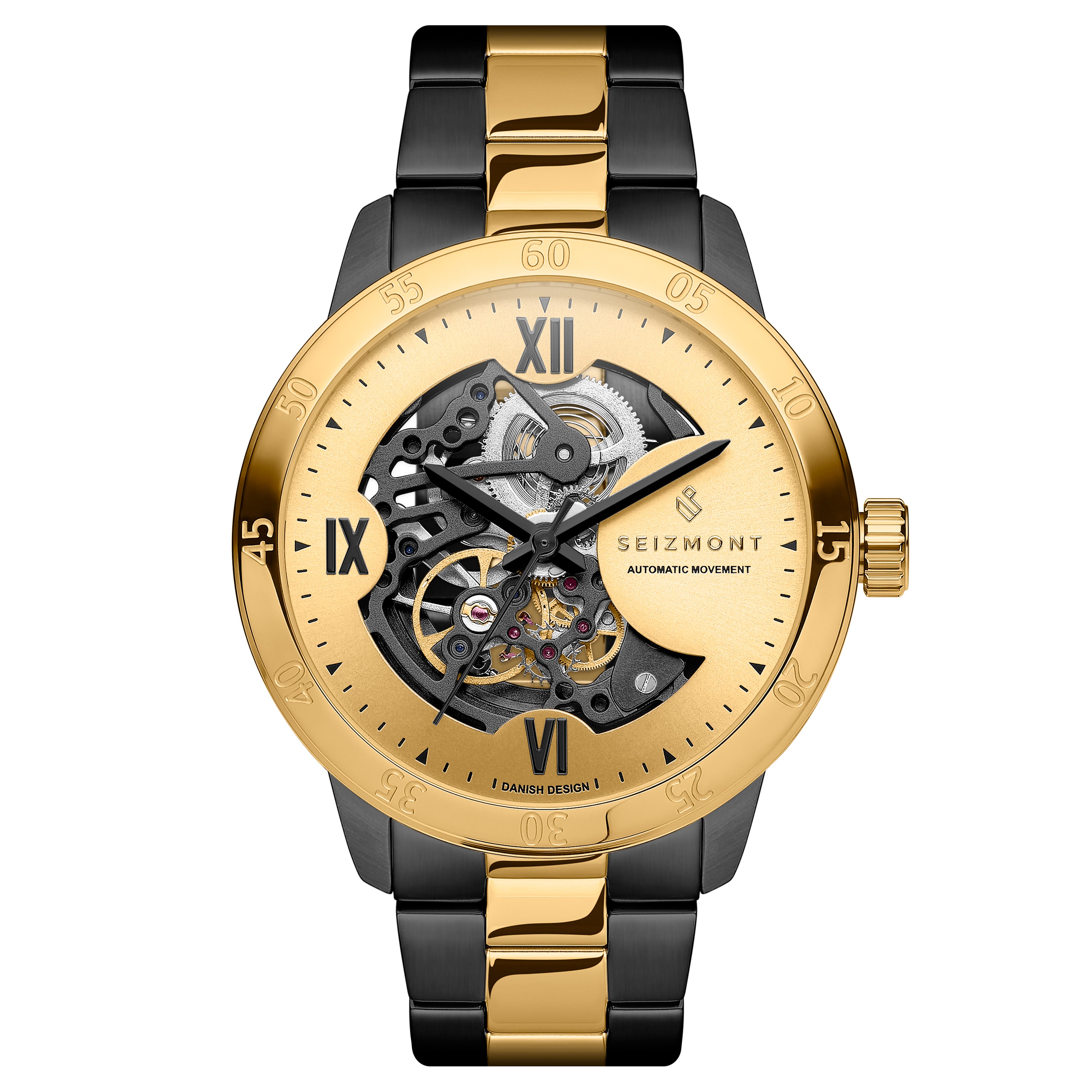
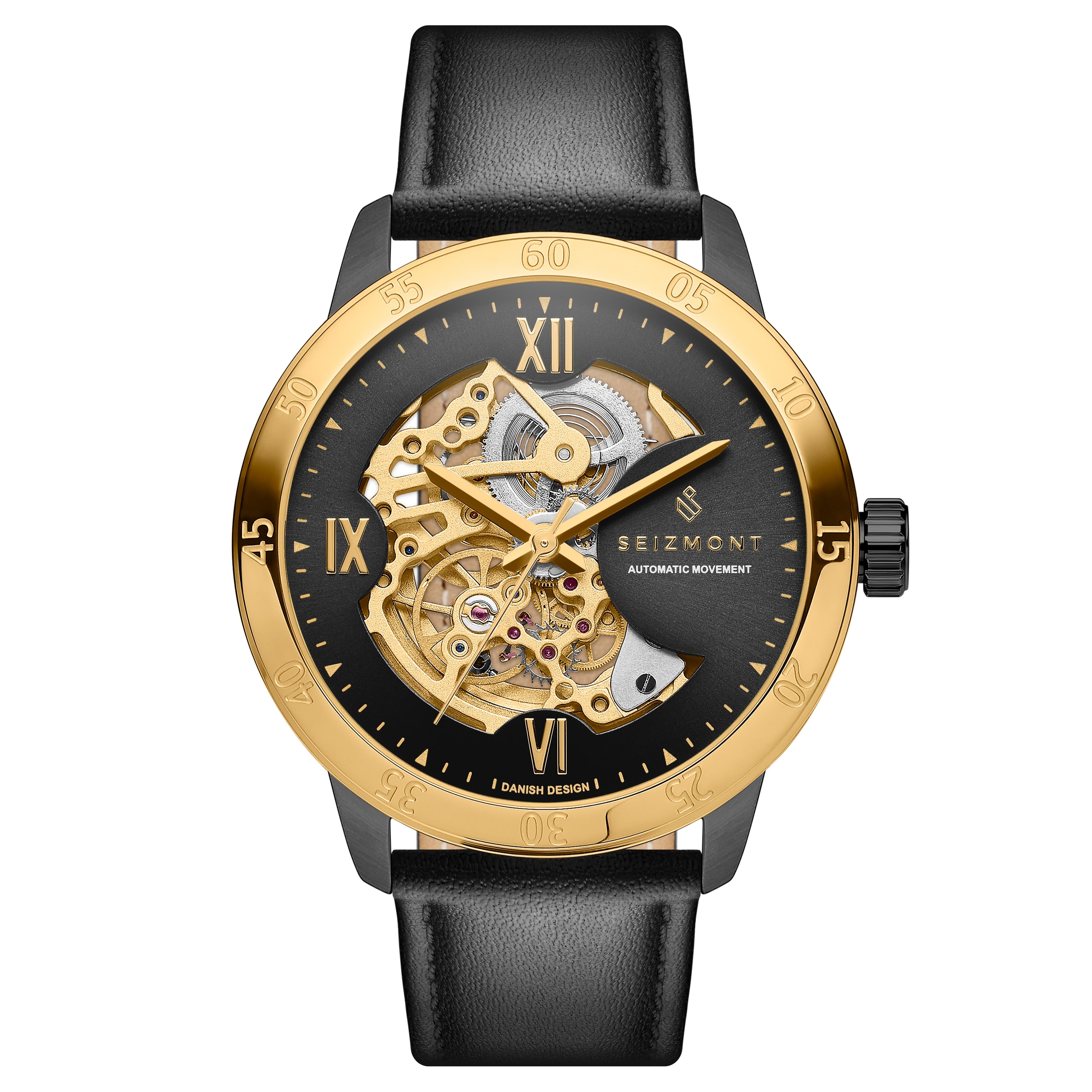
By far our most popular series of watches, the Dante, is getting a bit of a facelift. We regularly adjust our designs based on customer feedback, evolving aesthetic and design principles, and advances in manufacturing technologies.
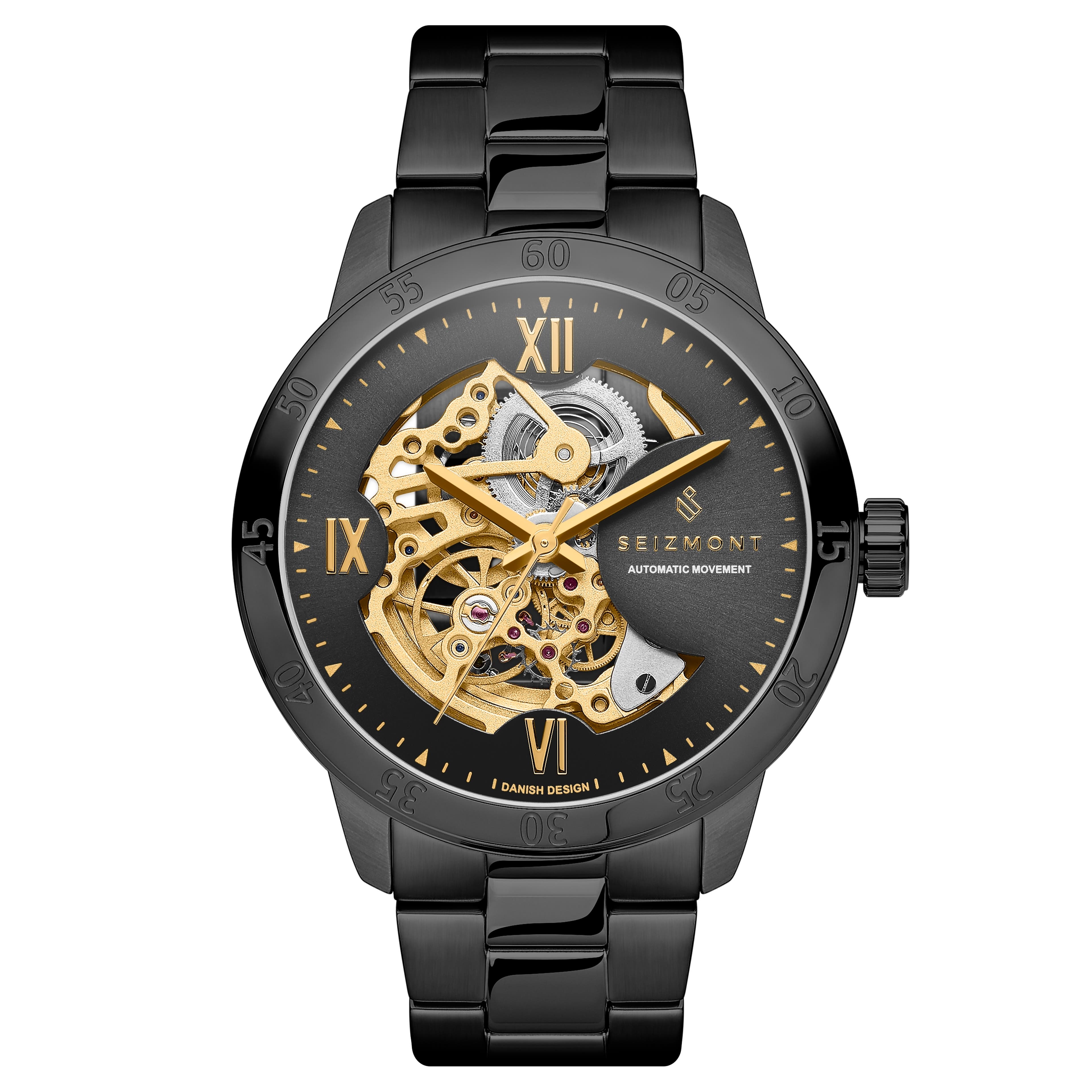
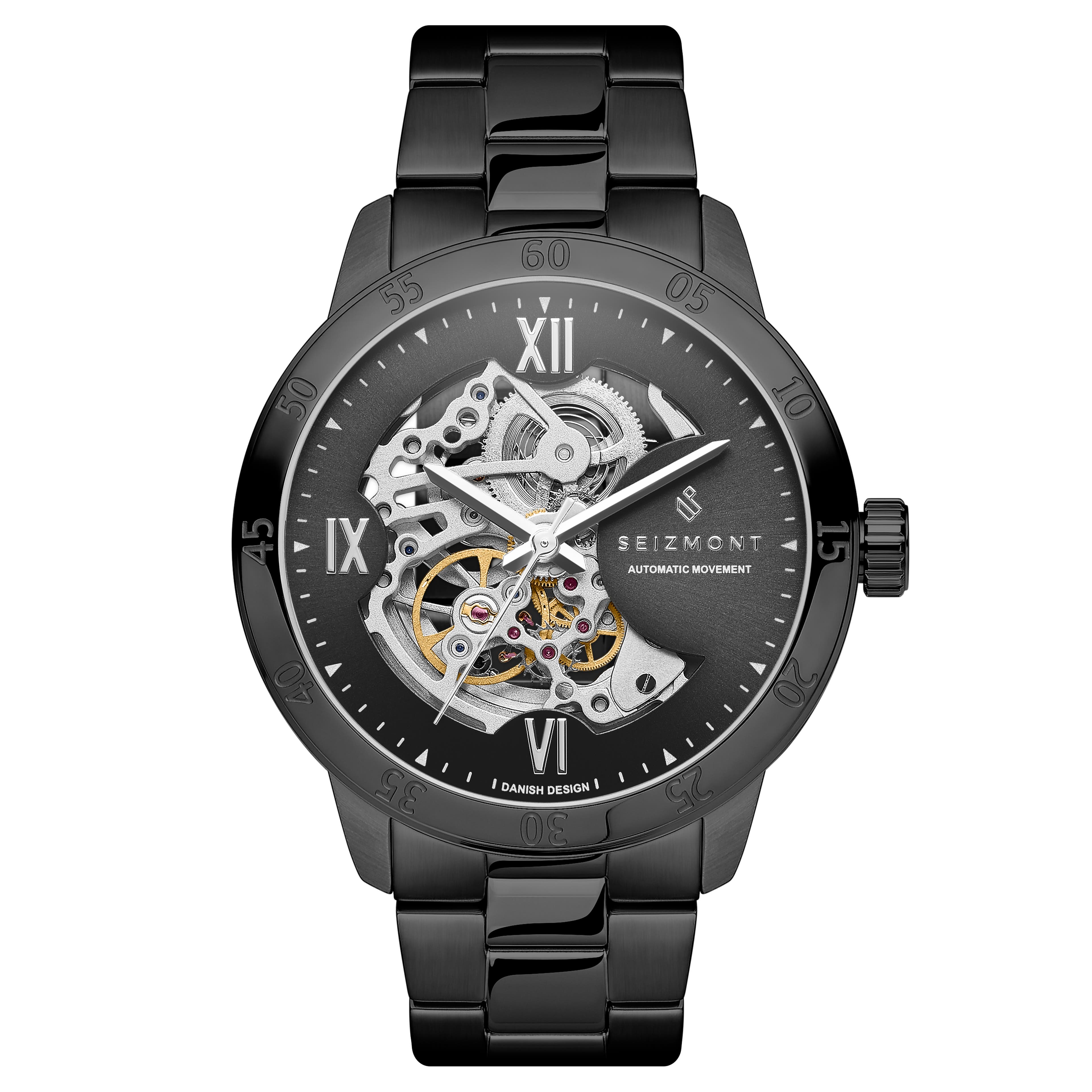
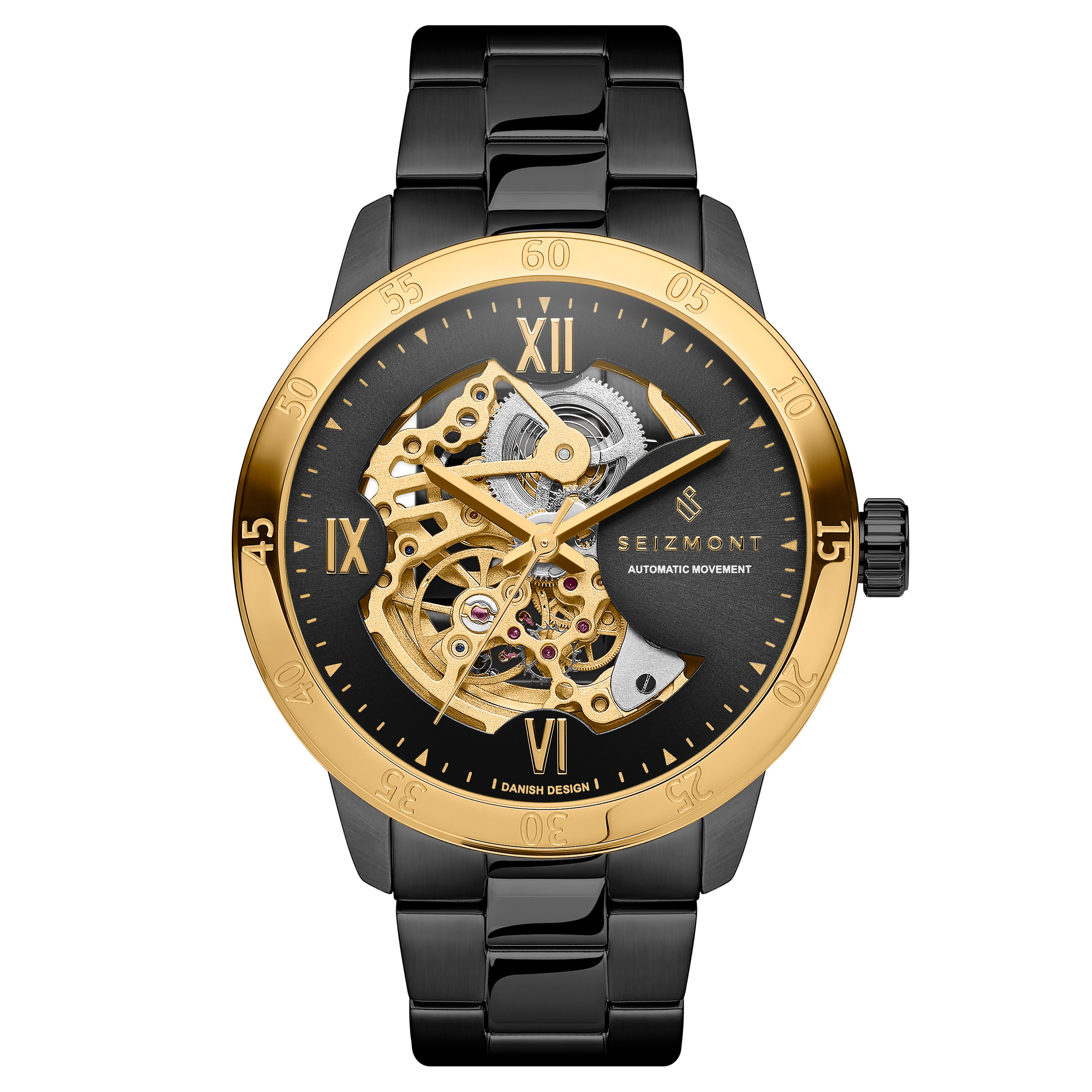
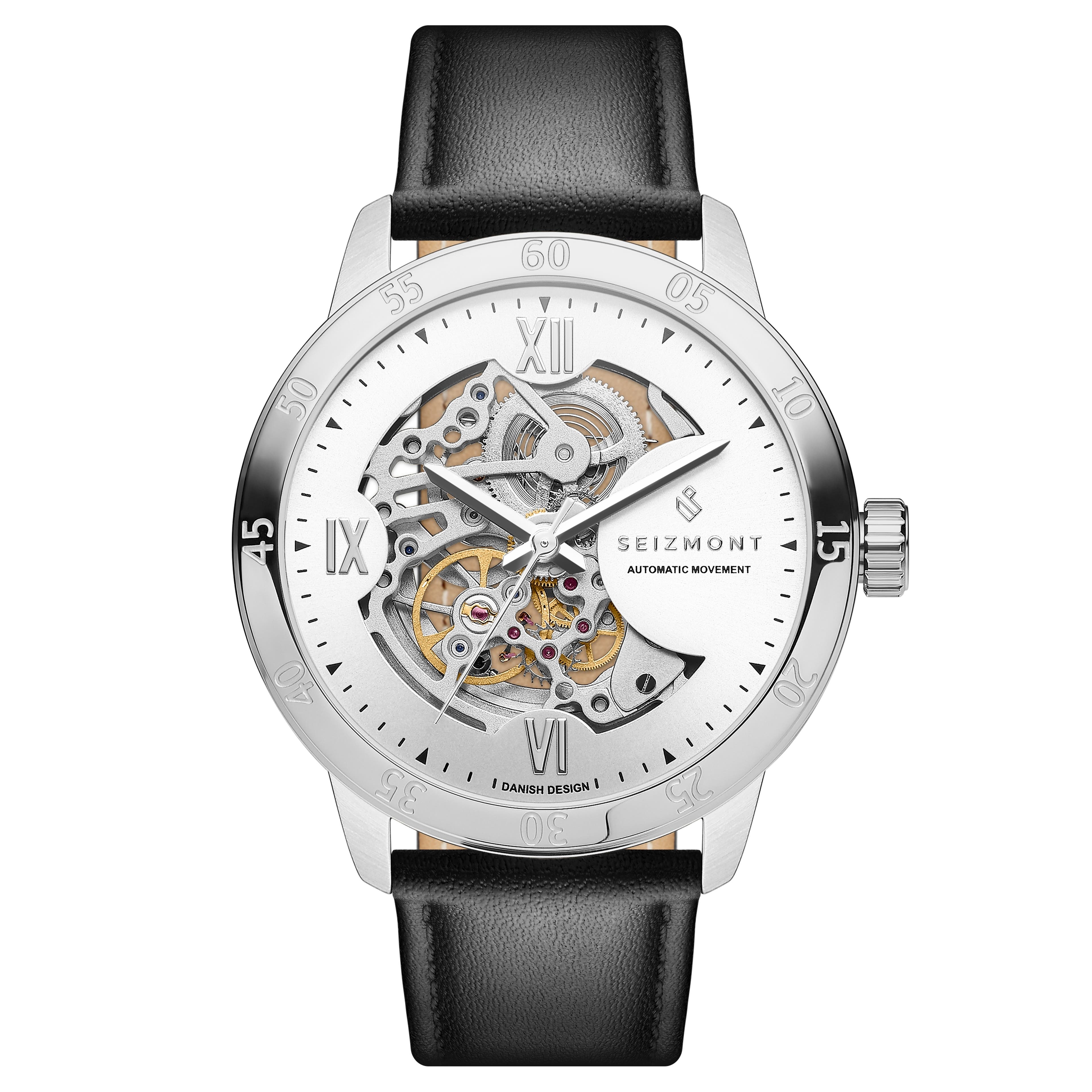
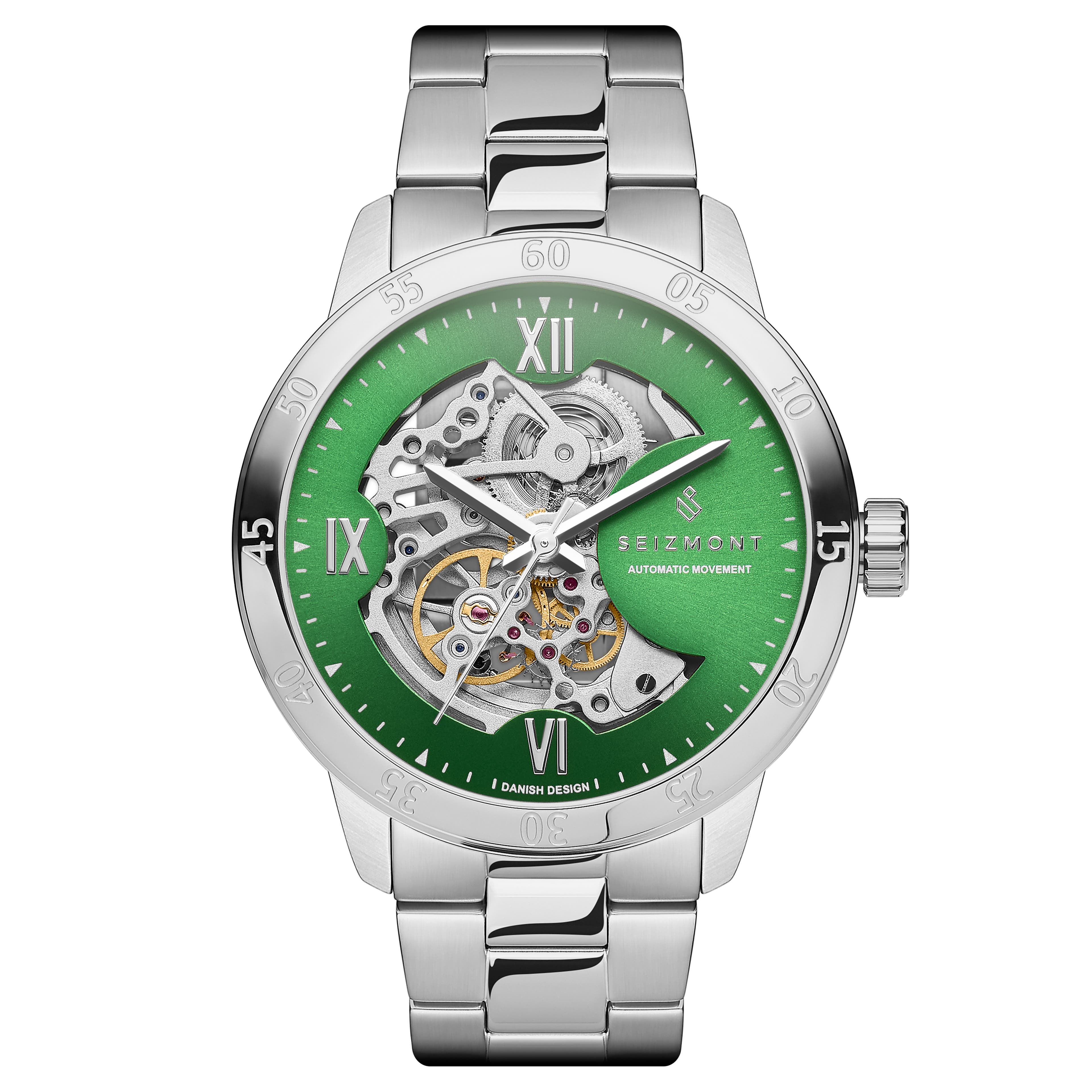
We redesigned the hands to make them stand out better against the exposed movement, and balanced the layout of the dial to provide clearer visibility and make the watch easier to read. We made the crown more angular, which gives it a strong aesthetic that fits the overall style and makes it easier to use, and gave the bezel deeper and bolder numbers. We added “Danish Design” in tiny letters at 6 o’clock and will be launching multiple new colour combinations. The watch will also come with longer straps for a more customisable fit.
As we prepare for the arrival of the new timepieces, we thought it’d be a good idea to explore how (and more importantly why) we designed the original.
A Bit of History
Why we wear wristwatches
If you think about quintessentially male accessories, a watch will be at the top of that list. They’ve become the centrepieces of our styles, but it wasn’t until a little over a century ago that we wore them at all.
Elizabeth I of England is said to have had a bracelet with a working ‘clocke’ on it as far back as the 16th century but until we started using them to coordinate attacks during the first world war, wristwatches were only worn by the fairer sex. Men had pocket watches.
The first Quartz wristwatch hit the market in 1969, making their movements more reliable, more accurate, and a helluvalot cheaper than mechanical watches. Mechanical movements were comparatively big, heavy, expensive, and less precise. So game over for them, right?
Not exactly.
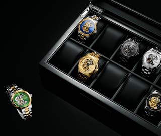
First off, Quartz movements aren’t particularly handsome to look at. Most of us have multiple watches and through the years, we’ve grown all too familiar with the frustration of taking one out of the box only to find it dead. In the age of sustainability, the idea of going battery-free wherever possible is also an attractive proposition. While some look to the future for ideas to improve, the answer, in this case, lies in a return to the classic.
In 1760, watchmaker André Charles Caron wanted to show his clients the intricacy of his clockwork, so he removed the dial on one of his pocket watches, exposing the mesmerising dance at its heart. His clients were amazed. He also realised that by removing this and other metal parts intended to hide the clockwork, he could make his watches lighter and thinner than any of his competitors. The skeleton watch was born.
All Hail the Dante
Long may he reign
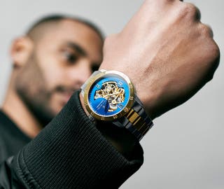
The Dante is inspired by our desire to move away from battery power while blending a sense of classic craftsmanship with modern aesthetics. We found the perfect balance in a watch that uses your movement as its power source and exposes its beating heart while keeping the dial easily legible.
Every accessory we make starts with a briefing - an internal document describing why we want to make a specific item. Quality skeleton watches are often prohibitively expensive and affordable ones are unreliable or made of shoddy materials. We wanted to change that by making a watch that maximises the quality/price ratio. That meant looking at everything from materials to movements to surface treatments with an unbiased set of eyes, examining where we get the biggest bang for our buck on every front.
The design of a skeleton watch starts with its movement. Going through multiple movement manufacturers, we found the perfect blend of affordability and accuracy in the Seagull ST1646, a movement renowned for its reliability. Our designers sketched out ideas that exposed its most active parts of the movement - the balance wheel, mainspring, escapement, and gears - while covering the less attractive bits, like the winding stem. This also gave us a nice little space on which to display the Seizmont logo.
Perfection is a Process
It can take a long time to get it right
Iteration after iteration, we moved closer to something we were happy with. The best design we then sent to multiple manufacturers for samples. Not only did we rigorously stress test these samples, but we used them to choose the most durable and most attractive surface colouring. PVD coating on surgical-grade stainless steel proved to be the strongest, most aesthetic combination, and when done at an industrial scale, made for a remarkably affordable and durable watch case.
The decision about whether to expose the rotor (the weight at the back that keeps your watch wound as you swing your arm) was also an interesting debate. On the one hand, you rarely see it when it’s strapped to your arm, so why bother exposing it. A glass caseback is more expensive than a simple stainless steel back and it’s easier to keep water out with a solid plate. On the other hand, for those interested in how automatic mechanical watches work (which applies to most of us who go for skeleton watches), the rotor, spring, and gears at the back are just as fascinating as the front. But if you intend to expose them, you’d better make sure they look good. And they do.
The final decision to make was mineral glass vs sapphire crystal. Our initial designs called for mineral glass, but once we saw how strong we could make the rest of the watch with surgical-grade stainless steel and high-quality PVD coating, it only made sense to ensure the crystal kept up so the whole watch was scratch and tarnish resistant throughout. Sapphire crystal is a lot stronger than mineral glass, and even though it raised the price a little, we ended up with a watch we’re truly proud of and one that’s available to all.
